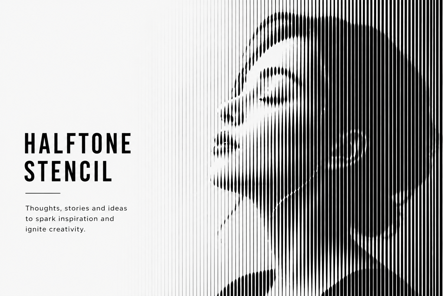
Halftone and Dot Stencil: A Simple Technique with a Strong Visual Impact
Halftone stencils may look complex, but they’re built on a simple idea - dots and lines creating depth. This guide walks through how they work, how to use them, and what makes them so effective in both small and large-scale projects.
If you’ve ever looked at a halftone design up close, you’ve probably noticed something interesting.
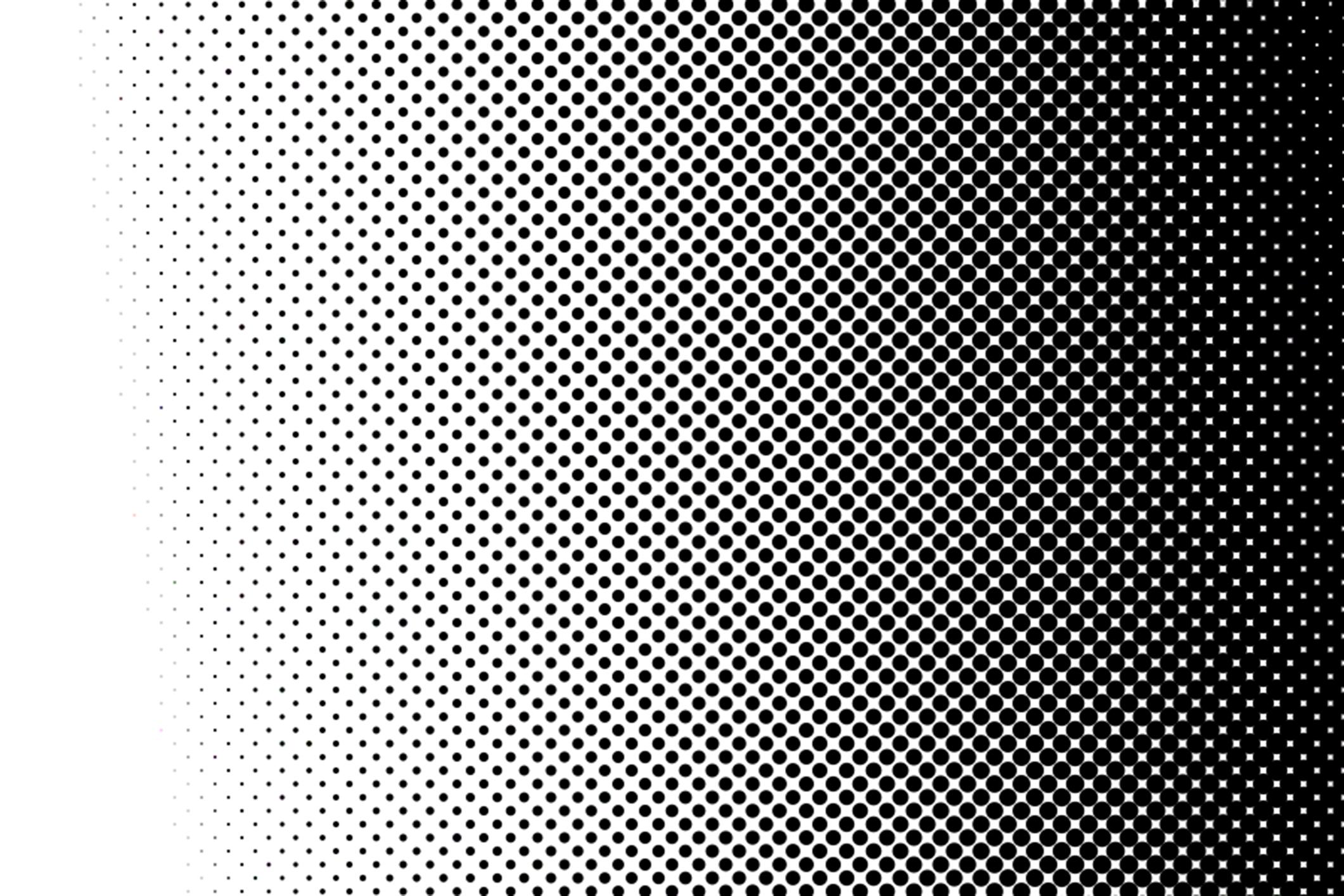
What looks like a gradient from a distance isn’t actually a gradient.
As you get closer, it becomes clear that the image is made up of dots - varying in size and spacing - working together to create the illusion of light and shadow.
At first glance, it may seem complex, but the principle is quite simple.
And that simple idea is exactly what halftone stencil techniques are built on.
What Is a Halftone Stencil
Unlike traditional stencils, where you fill in solid shapes, a halftone stencil is based on repetition.
Small dots, arranged in patterns, create the effect of gradients and depth.
This style is most commonly associated with:
- comic books
- pop art
- vintage and retro graphics
Even though the concept is simple, the final result can look highly detailed and visually rich.
Types of Halftone Techniques
Although halftone is most often associated with dots, that’s not the only way to represent tones.
The core idea remains the same - repeating a single element to create the illusion of light and depth - but the execution can vary.
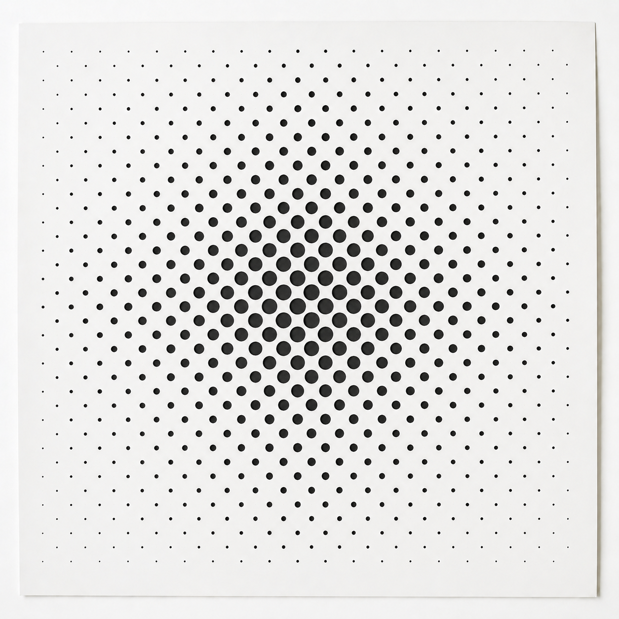
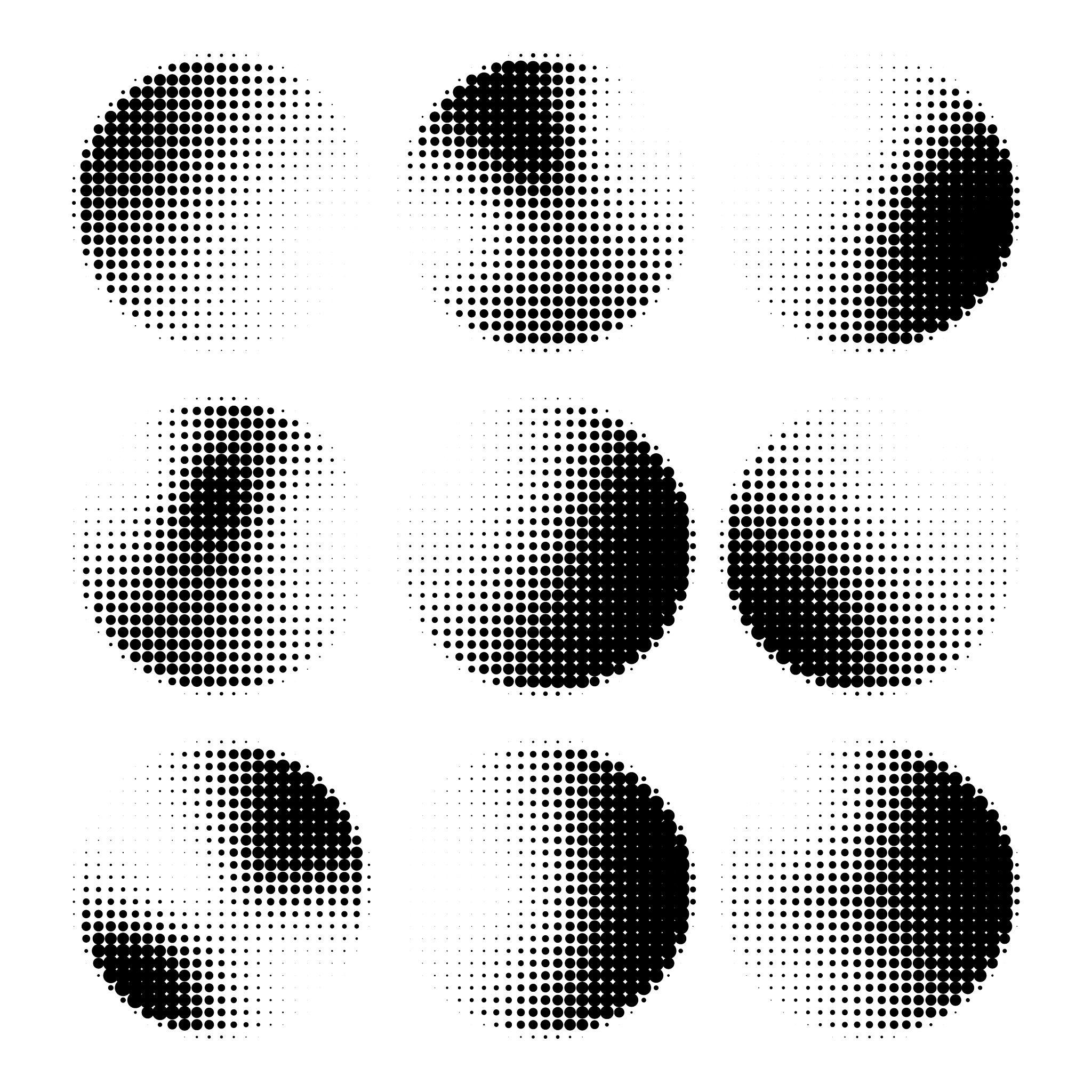
1. Classic Halftone (Dots)
This is the most recognizable and widely used form of halftone.
It’s based on dots of varying sizes and spacing.
Larger, denser dots create darker areas, while smaller, more spaced-out dots produce lighter tones.
It is most commonly used in:
- stencil work
- pop art
- graphic design
Because of its clarity and simplicity, this is the most practical option for most projects.
2. Line Halftone (Lines)
In this variation, dots are replaced with lines.
The visual effect is created by changing:
- line thickness
- spacing between lines
- and sometimes the shape of the lines
This technique is often referred to as:
- line halftone
- line screen
- wave halftone (when the lines are curved or wavy)
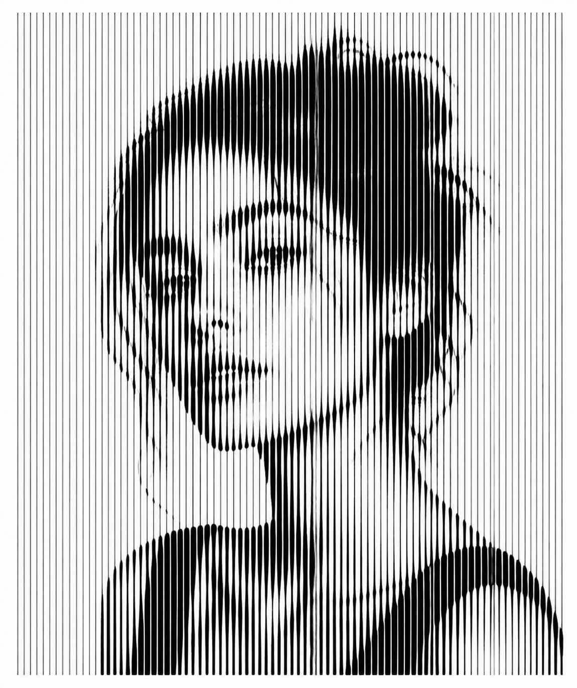
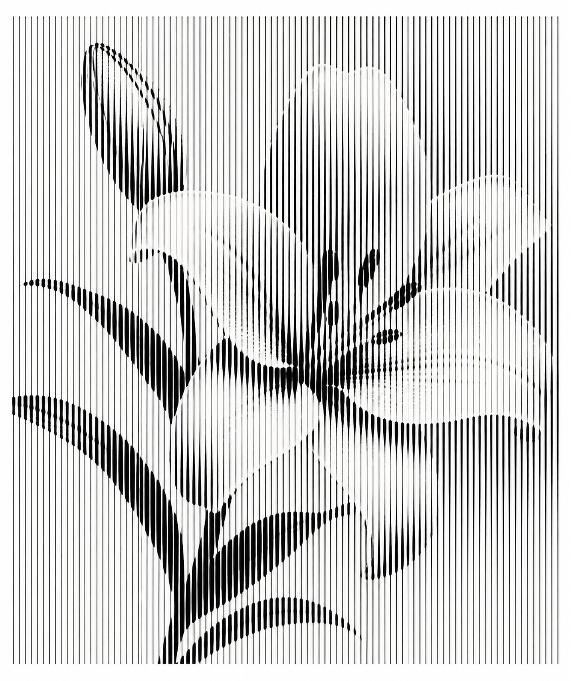
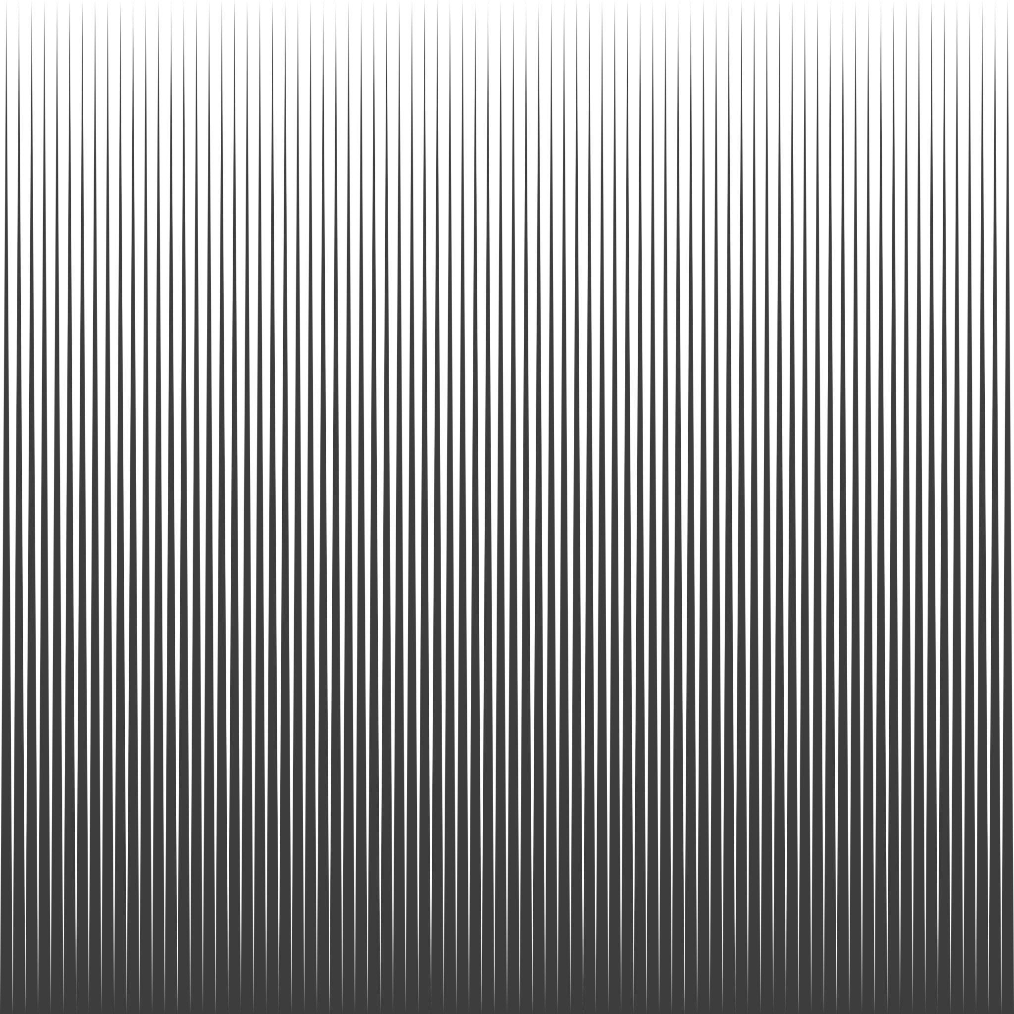
The principle is the same, but the visual result feels different - often more modern and graphic.
What Makes Halftone Stencils Different to Work With
Working with halftone stencils requires a different approach compared to traditional stencils.
With standard stencils, the goal is full coverage.
With halftone, the goal is to preserve the clarity of each individual dot.
If too much paint is applied, the dots begin to merge and the effect is lost.
For that reason, it’s best to:
- work gradually
- apply smaller amounts of paint
- build the result in layers
This shift in approach is key to achieving a clean result.
How to Use a Halftone Stencil
The process itself isn’t complicated, but it does require precision.
It’s important to pay attention to:
- using a smooth surface
- keeping the stencil stable
- applying paint lightly and evenly
- working in multiple thin layers instead of one heavy pass
- removing the stencil carefully
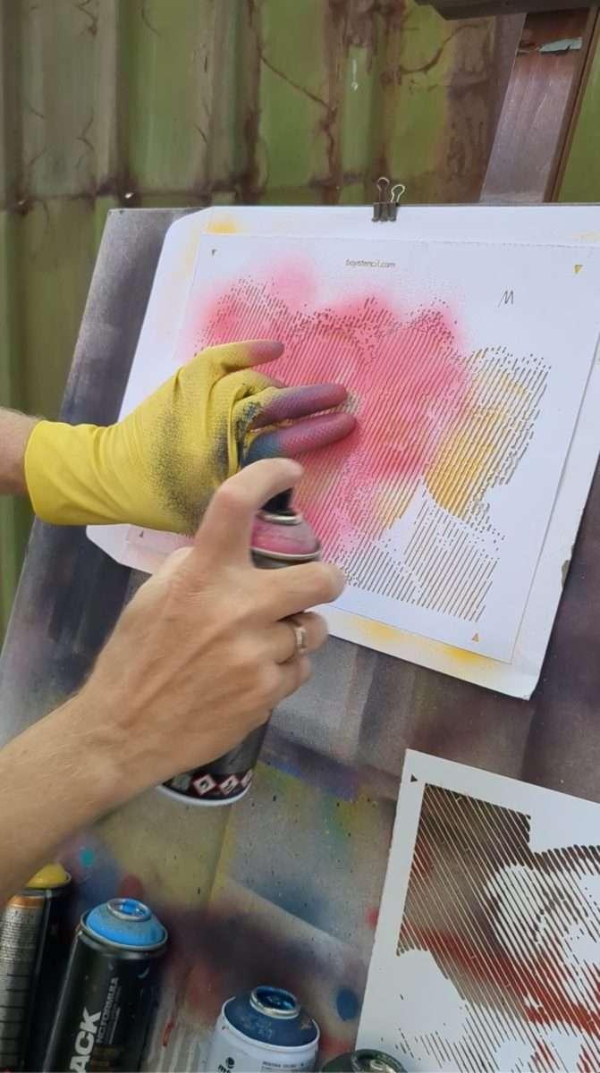
That final step often makes the biggest difference.
Common Mistakes
Most issues come down to overdoing it.
Typical mistakes include:
- using too much paint
- applying too much pressure
- working too quickly
Halftone techniques require control and patience, but with practice, the process becomes intuitive.
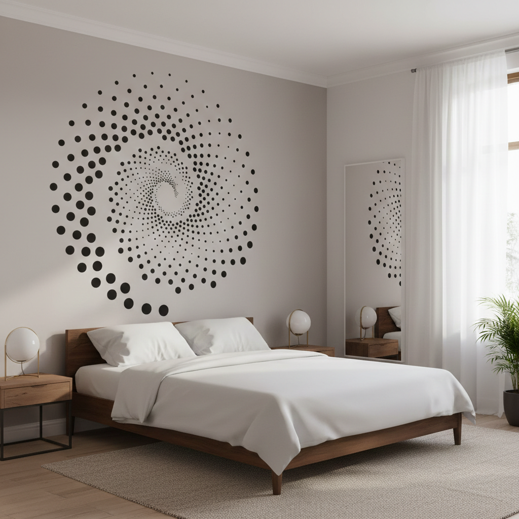
Where Halftone Stencils Are Used
Halftone stencils are used across a wide range of applications:
- street art
- screen printing
- posters and graphic design
- visual identity and branding
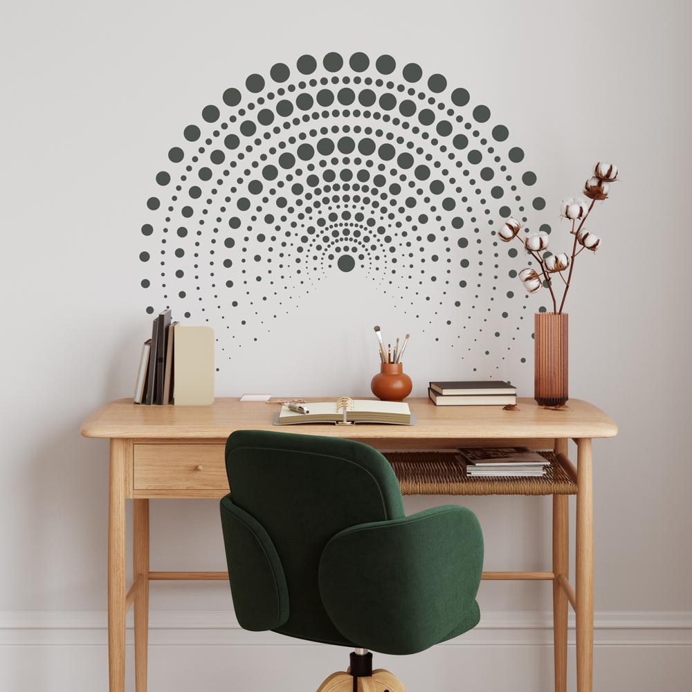
More recently, they’ve also been used in decorative projects as a strong visual element.
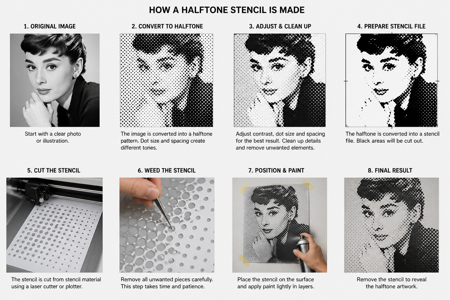
Creating Your Own Halftone Stencil
The process usually starts with a photo or illustration.
The image is then converted into a halftone pattern, where the size and spacing of the dots are adjusted based on the tonal values.
While there are tools that can automate this process, achieving a high - quality result usually requires some manual adjustment - especially when turning the design into a physical stencil.
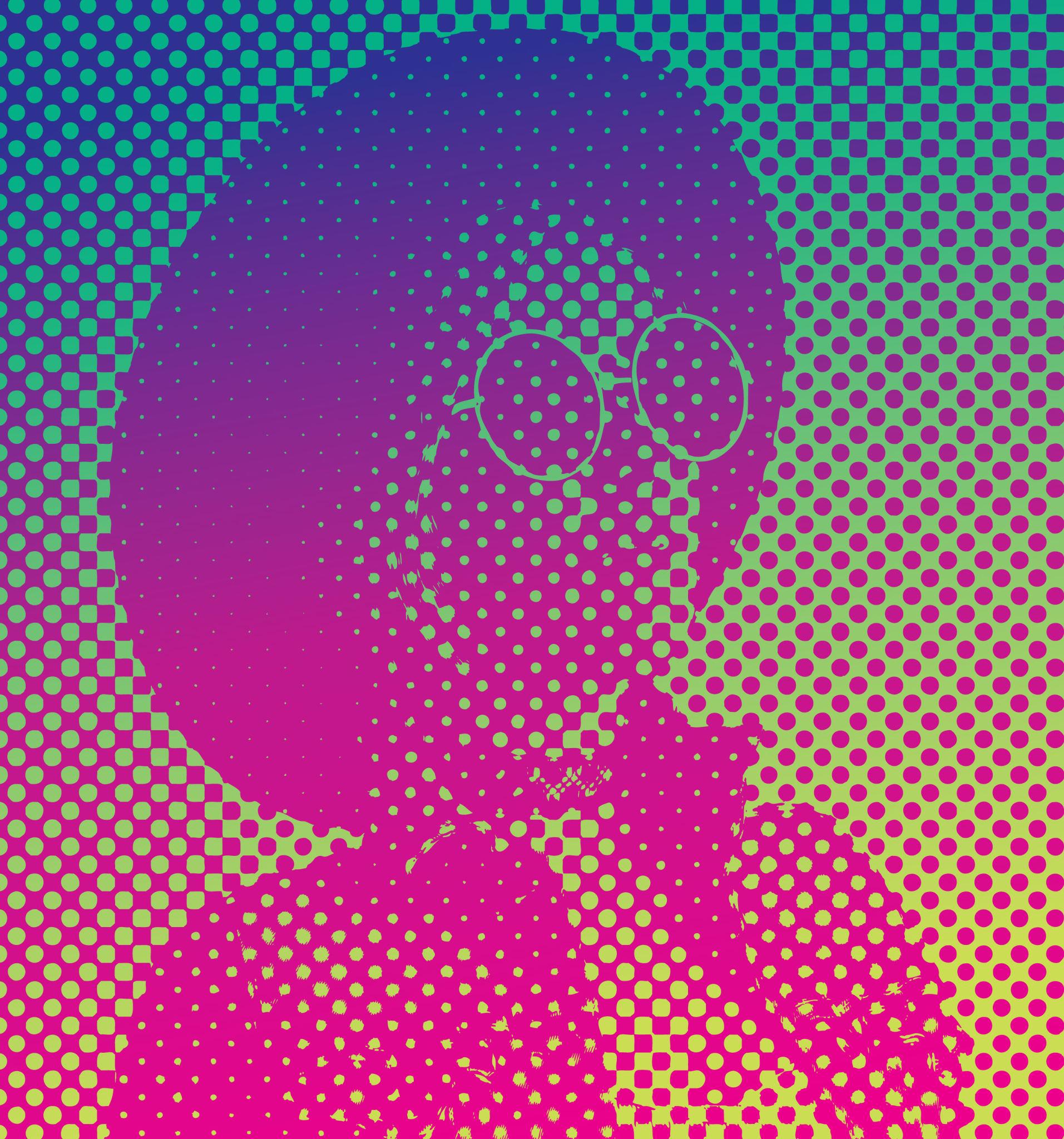
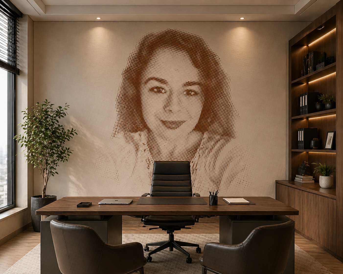
A Real Project: Large Halftone Wall Stencil
Idea and Challenge
One of the more interesting projects involved creating a large - scale halftone stencil for an interior wall.
The goal was to turn a portrait into a visual piece that works across an entire wall.
With projects like this, it quickly becomes clear that what works on a small scale doesn’t always translate the same way when enlarged.
Details that look good on paper can get lost, and the overall impression depends heavily on how the image reads from a distance.
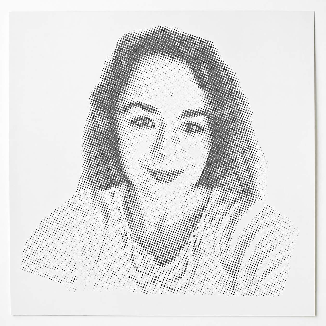
From Image to Halftone Pattern
The project started with a portrait, which was then converted into a halftone pattern.
Special attention was given to:
- dot size
- spacing
- overall readability of the image
With halftone work, it’s important to think about two perspectives:
- how it looks up close
- how it looks from a distance
Too much detail can disappear, while too little can make the image feel flat.
Making the Stencil for a Large Surface
Due to the scale, the stencil wasn’t made as a single piece.
The design was divided into multiple sections, allowing for:
- easier handling
- more precise alignment
- better control during application
For larger projects, this approach is standard and significantly reduces the risk of errors.
Applying the Stencil to the Wall
The application process required additional precision.
Compared to smaller projects, the key factors were:
- consistent pressure
- controlled paint application
- accurate alignment between sections
At this scale, even small mistakes become visible.
When done properly, the result is very striking - from a distance, you see a full portrait, while up close, the structure of dots becomes clearly visible.
Conclusion
Halftone stencil techniques may seem complex at first, but they are based on a simple principle - repetition that builds a complete image.
In larger projects, such as wall applications, this principle becomes even more apparent. These works go beyond decoration and become a defining visual element of the space.
The combination of a simple structure and a detailed visual result creates something that feels both intentional and professional.
When the approach is adjusted - with less paint, less pressure, and more patience - the results become clear and consistent.
And at that point, halftone stops being a challenge and becomes a very rewarding technique to work with.